AsaTrader, menu & settings redesign
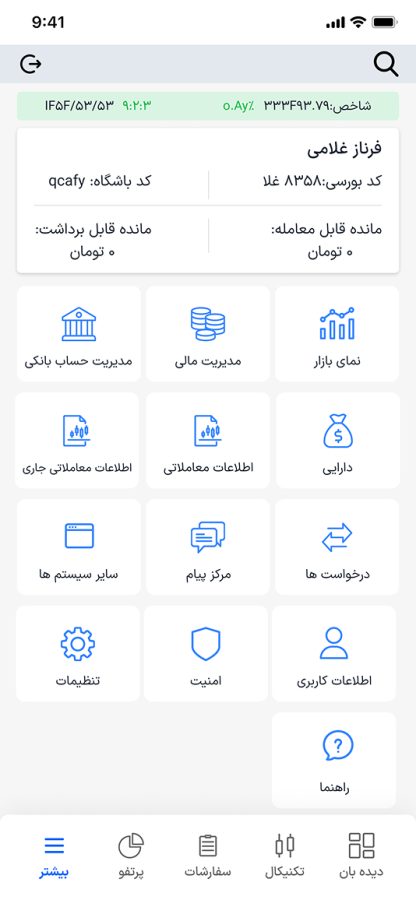
AsaTrader is Agah Brokerage’s mobile trading app, and its support call center kept logging the same complaint: people couldn’t find their way around the “Other” menu and Settings, bank accounts, financial tools, market views and account details were all flattened into one dense grid of icons with no hierarchy between them.
- Client
- Agah Brokerage
- Role
- UX research & interaction design proposal
Overview
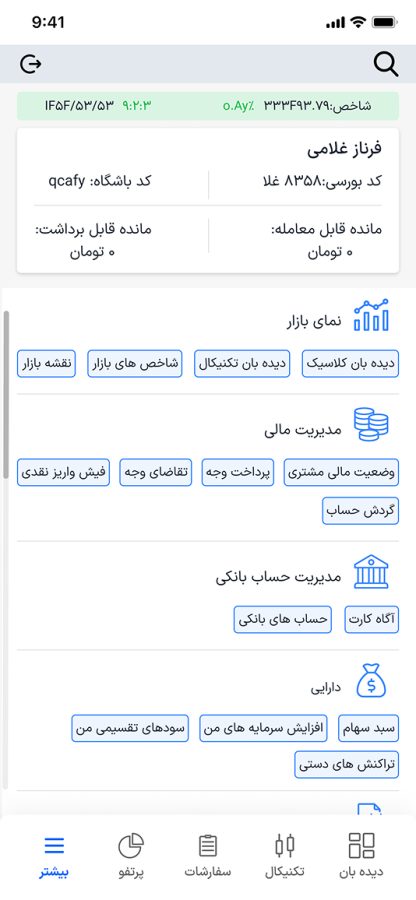
Working from the call center’s logged issues, the proposal regrouped that grid into named categories, Market View, Financial Management, Bank Accounts, Assets, each expanding to show its sub-actions directly, instead of hiding them one tap deeper. Deposit slips, fund withdrawals, portfolio growth and manual transactions became visible at a glance rather than guesswork behind an icon.
The deliverable was a proposed redesign, not a shipped feature: annotated screens and a rationale tying each change back to a specific category of support call, aimed at cutting “where do I find X” tickets and giving users a faster, clearer path through the app.
Gallery