Agah UI Kit, component design system
Agah’s products, marketing landing pages, the Food Mood platform, AsaTrader, were designed and built by different people at different times, and it showed: buttons, spacing and even shadows drifted slightly from one surface to the next. A shared, component-based UI kit was built to give every one of those products the same visual and functional vocabulary.
- Client
- Agah Brokerage
- Role
- Design system design
Overview
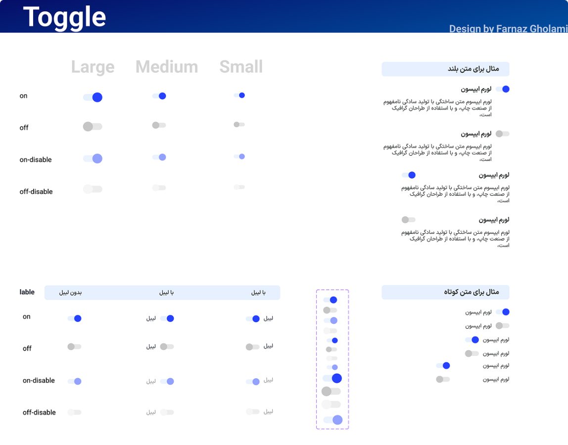
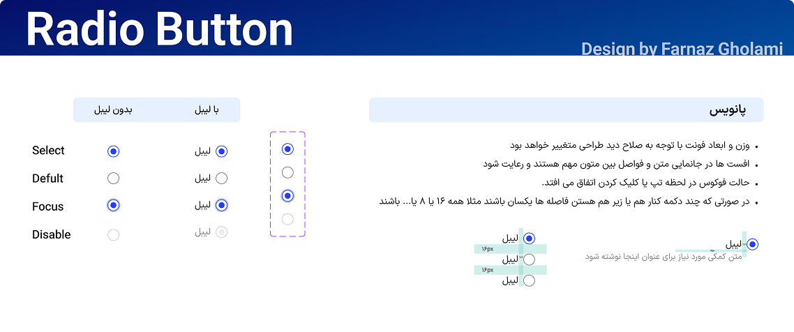
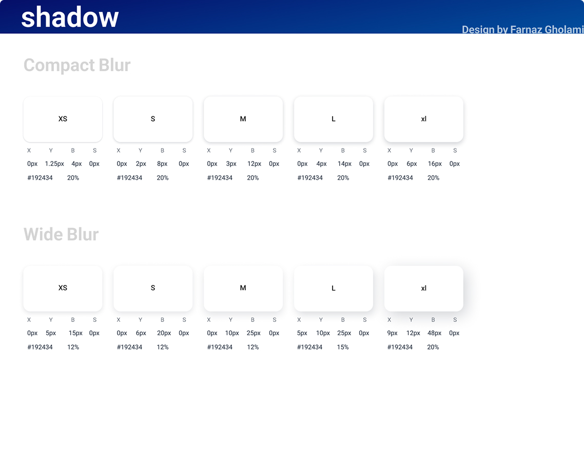
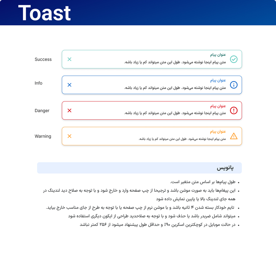
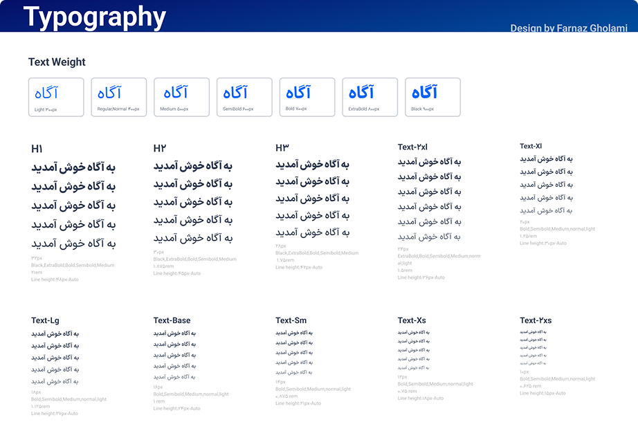
The kit specs each piece down to the states engineers actually have to build: a type scale running from Light to Black across twelve sizes with defined line-heights, a toggle in three sizes and four states (on, off, and their disabled variants) with and without a label, radio buttons across default, focus and disabled, a two-tier shadow scale, compact and wide blur, five sizes each, tied to exact blur, spread and opacity values, and semantic toast styles for success, info, danger and warning, each annotated with the spacing and sizing rules needed to place it correctly on a page.
Rolling the kit out across the landing pages and Food Mood took the guesswork out of both design and implementation, speeding up delivery and cutting the small inconsistencies and implementation bugs that crept in when every product styled its own components from scratch.
Gallery